Braun colour choices – placing function above beauty
Coordinating colours.
Braun design never placed beauty above function. Still, the aesthetically pleasing appearance of the products cannot be overstated. When the audio category first launched in the middle of the 20th century, attached objects sported a look that was completely novel to the time, its society and its market.
Braun got rid of unnecessary adornments and embellishments, overhauling the antiquated, furniture-like visual standard of contemporary pieces. The bareness of the products was arguably most evident in their lack of colour. With a primary palette of subtle blacks, pale greys and off whites, flamboyant tones weren’t a frequent sight in the Braun catalogue.
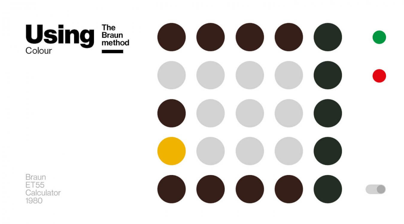
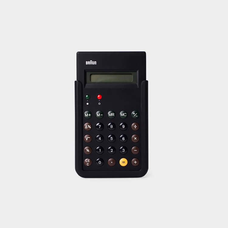
Of course, Dieter Rams was instrumental to what is now understood as classic Braun design. Careful in his use of colour, he advocated the benefit of applying it if it told the user something. The ET 66 calculator, featuring a yellow equals symbol as the only colour-coded element outside the standard green/red for on/off, is a striking example of this.
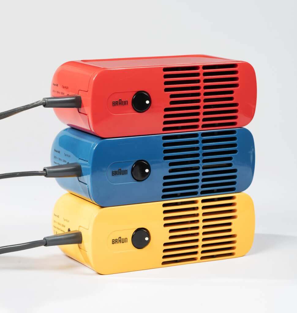
Giving everyday products a flashy appearance makes them ‘too dominating‘ in a space, and ‘design shouldn’t be dominating,’ Rams says. Still, if he felt an all-colour aesthetic would fit a product, he didn’t shy away from making it so either. His HLD 4 hairdryer from 1970, for instance, came in red, yellow and blue. Other colour creations carrying the Braun name include the 1973 T 3 table lighter, 1969 KMM 2 coffee grinder and, more recently, various analogue alarm clocks.
The overriding colour chart remained unassumingly neutral throughout the years, however. Braun products offered unprecedented coherence and consistency in their execution: For 40 years, from 1955 to 1995, they were created by more or less the same team under the same head of department using the same methods.
It is completely logical that the resulting signature look would be an unmistakeable one. Nothing about the design – the simple, very reduced aesthetic that seems so natural and yet so hard to replicate – feels processed or contrived. Examining the Braun menthod, whether that’s in regards to construction, language or presentation, there is one shared characteristic that springs to mind: eloquence.
LE colouring.
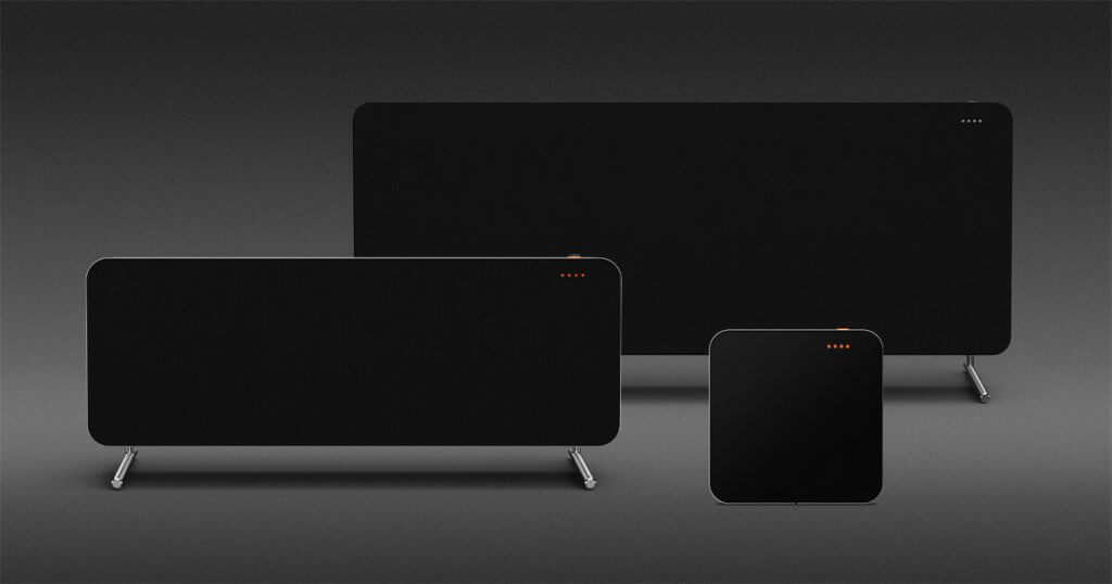
The contemporary speaker line conforms with past approaches to colour design. We opted for neutral black and white shades as the base and added subtle hues of colour to signal a specific speaker activity. For instance, orange dots mean the microphone is off, while white indicates processing of a voice command. When pairing with Bluetooth, the light sequence turns blue.
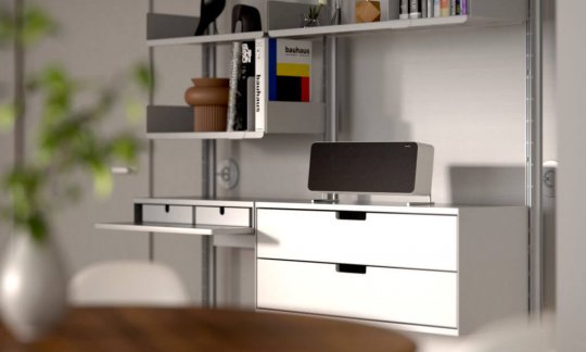
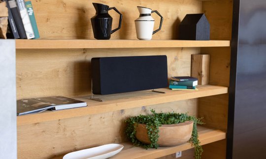
We kept the speaker grille uniform for both colour variants; however, visual singularities become apparent from other viewing angles. The black LEs are stripped down to their essence, bold without being intrusive to your home decor. The white speakers in their minimalist execution exhibit the perfect interplay of light and dark.